Monday 12 March 2012

Artist's ideas and concept

Artists are inspired by many things.

Some of these things are:
Thumbnail sketches
Natural world
Personal experiences 
Their imagination
Everyday life

Kingdom Hearts is one of my all time favourite franchises, mainly due to the art style and the nostalgic factor of Disney.

The creator of Kingdom Hearts is Tetsuya Nomura, a Japanese video game director and character designer working for Square Enix. The idea came to him when he was working with Square Enix, he managed to meet the director of Disney in an elevator (Disney and Square Enix were working in the same building at the time). The early development process was a bit rocky, one side wanted a game based on Mickey Mouse, the other wanted a Donald Duck title. Tetsuya wanted a game where the game's story would equally involve EVERY character, they settled on a game mainly about a brand new character and having the already known characters play a big role in the story. When Tetsuya pitched his idea to everyone they were a bit unsure on the direction Tetsuya was going, due to the main character having a chainsaw like sword.

The main character was set to be a young boy wielding an unusual weapon. In the end they settled for a less monkey like person and used a plain and simple human form, they also swapped the chainsaw for a giant key (the key will play a big part in the game's story line).

Pablo Picasso 
Picasso went through a phase of using cold colours and made them look slightly depressing. He went through this phase because his friend Carlos Casagemas commited suicide in Paris, as soon as he heard of this news he went into a 3 year long depression and expressed his feelings through his paintings. The 'Blue Period' is home to some of his most famous paintings, but he had alot of trouble selling them at the time.

Salvador Dali's melting clocks painting. This is probably his most famous paintings in his surreal career. Dali was really into surrealism and this painting really shows it off, the fact that clocks dont normally melt and the landscape itself is pretty strange, the objects in the painting seem to have potential to look 3D but they actually look very 2D when you look at them properly. A lot of Dali's paintings came from dreams he had, dreams which were so interesting and surreal he just had to paint them.

Monday 16 January 2012


Our first exercise was to create the yin and yang symbol in Adobe Illustrator. 


Our second exercise was to make a certain landscape but with emphasis on the depth.


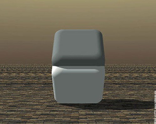
This is a cube.


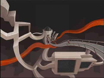
A bird attacking a man.


Rhythm in pictures

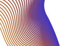
Pictures have a rhythm in 3 different forms; progressive, regular and flowing.


This is an example of regular rhythm, the lines follow the same pattern over and over until it takes up the whole image. I like how the black is the more dominant colour because it makes the image stand out more.


Here is another example of regular rhythm, the image has 2 examples of regular rhythm where the brown parts are more spaced out and the metal grate is more compact. I don't really like this image because the photographer took it at a 45 degree angle which is apparently the only way to make it artistic.


This picture represents flowing rhythm, the lines are all slightly different but they end up going in the same direction. I like the transition from orange to purple being so subtle and where the lines are right next to each other it looks like a normal gradient.

The image also has flowing rhythm where the lines all go in the same direction but some of them branch out like a zebra's stripes. I like the image because it all random and psychedelic, when you blur your eyes it kinda looks like the cut up layer merges with the flowing layer.
This image has progressive rhythm where the triangle seems to rotate and enlarge at the same rate as each other.
The beads are showing progressive rhythm because they get larger with every new bead.

Visual Language Exercises

Regular Rhythm

Progressive Rhythm

Flowing Rhythm

Monday 21 November 2011

Evaluation of the D and AD brief.

Today, we had to come up with a concept for Internet Explorer to get people aged 18 to 25 to explore the internet more.
I have learnt that it is important to go through many stages in creating concepts and that you need to ome up with many ideas before you choose the one you're going with.
We done this activity to help us come up with ideas. That ability will come in handy in the future when I need to come up with several ideas for another project.
My work seemed like a good idea until it didn't really fit the design brief very well. It was a music player where you can share your music with people around the world to find new artists and songs, a good idea at first but it had to help people search different websites, not different artists.
The ideas had to fit a relation between the virtual world and the real world in a smooth and natural way. Mine didn't really fit the real life end apart from up coming artists can get publicity through this.

Monday 7 November 2011

Interactive Media

http://www.zoomquilt.org/
http://www.rudyrucker.com/blog/images/zoomquilt1.jpg
http://www.paris-26-gigapixels.com/index-en.html
http://blog.algorhythm.de/wp-content/uploads/2010/03/100313_paris_26_gigapixels_1.png
http://www.gigapan.org/gigapans/48492/
http://www.hiddengarments.cn/wp-content/uploads/2010/05/dubai-45-gigapixels.jpg
http://www.gigapan.org/gigapans/33411/
 http://www.destination360.com/europe/macedonia/images/s/macedonia.jpg
http://www.harlem-13-gigapixels.com/
 http://ursispaltenstein.ch/blog/images/uploads_img/gerard_maynard_harlem_13_gigapixels_1.jpg

Scientific Images or Optical Illusions

http://unrealitymag.com/wp-content/uploads/2009/12/optical_illusions_2.png
This image is of straight lines with black and white boxes inside of them to fool the audience into thinking there is a lack of parallel lines.
http://listverse.files.wordpress.com/2007/09/232px-hermann-grid-illusion.svg-tm.jpg?w=300&h=300
This image is of black boxes spaced apart enough so there are black dots in the intersections where the audience is not looking.
http://25.media.tumblr.com/tumblr_lmo7gjEwMx1qznlujo1_500.jpg
This image gives the effect of a spiral. They are actually perfect circles.
http://farm1.static.flickr.com/178/470927022_083e10e7cc.jpg
This image makes the 2 faces of the shapes are different colours, they are actually the same colour.
http://galerinhabigfesta.com.br/blog/wp-content/uploads/2011/09/ilusaobigfesta.png
This illusion makes it look like there is a blue and a green between the colours. The green and blue are actually the same colour.